None
1.
Bad football kits are around every season, with teams wanting to make statements, turn heads and sponsors wanting to get their own agenda across. We've compiled a list of the best/worst digital print football kits ever—dive in and help us figure out which we love and which we love to hate.
2.Stoke City
This Stoke City kit from 1996 literally looks like something you could make on a combination of Word Art and Microsoft Paint. Which makes it impossible to tell if it's really steezy, or really not.
via The Guardian
3.Southend United
This goalkeeper's kit from Southend United's 1995 season properly looks like a Wetherspoons carpet, or the seats you see on the tube in old TV shows. Either way, it's not a good look.
via Twitter
4.Arsenal
This Arsenal away strip from the '92 season is a fan favourite, but has a permanent place on just about every "ugly football kits" list ever. The JVC era at arsenal saw some pretty interesting strips, but the zig-zag "bruised banana" pattern on this one takes the biscuit. Now, do we want it or do we want to burn it?
via Bet Sports News
5.1860 Munich
This commemorative home kit from 1860 Munich's 2010 season celebrates 150 years of the club. It doesn't just sport the strangely unsettling blue/black collage of figures from the club's history along with resplendent gold trim, it's only bloody reversible! The bad news is the reverse kit isn't too good either, unless you like gold and green stripes.
6.Évian Thonon Gaillard
This home shirt is from French club Évian Thonon Gaillard's 2011 season. The club lives in a weird state between its roots in Swiss football and its current home in France's Thonon-les-Bains, with constant rumours about the club possibly making the move back to the area around Geneva. If the image of the Swiss Alps on the shirt isn't enough to give it away, we aren't sure what would be.
7.Regina Calcio
Serie B side Regina Calcio commisioned this kit for ONE game in their 2011 season against rivals Crotone. The shirt was designed to make the players look like ancient Greek statues of Gods, only more mobile, obviously.
via Bleacher Report
8.Nara FC
This kit belongs to the Japanese team Nara FC, a second-tier team who play in Kansai Regional League division 1, and compete every season for promotion to the Japanese Football League. The strip from 2012 looks less like a team seeking promotion to the big leagues, and more like a little girl's pyjamas. Someone find My Little Pony.
via canada.com
9.CD Lugo
Spanish second division club CD Lugo stumbled upon a happy coincidence, not only was their 2014 sponser a delicious refreshing beer, their kit was designed to look like one, complete with the all-important continental head. OH, WE GET IT NOW.
via Telegraph
10.Brazil National Team
This third kit from Brazil in 2011 was proposed by a fan who happened to be an avid fan of rock music and an advocate of the classic Brazil Gator strip. The national team decided to reintroduce the Gator design, with the fan's suggestion of a rock theme, and this was the result. Perhaps best left off the pitch, but still steezy as all hell.
via Calecao Futebol
11.Republic of Ireland National Team
This Republic of Ireland 1995 goalkeeper's shirt definitely deserves it's place on this list, with the purple, yellow and green monstrosity previously being voted the ugliest European football shirt. Just in case you were wondering the significance of "fai" it stands for Football Association of Ireland.
via Off The Post
12.Estonia National Team
This Estonia goalkeeper's kit from 1996 has a pretty funny story to go alongside it. It was worn (or, not worn) for the infamous "one team in Tallinn" match where Scotland and Estonia disagreed about the kick off time and the match was delayed by a year, which was slightly overdramatic. Still, at least this goalkeeper's kit shows the important link between Estonia and the Aztecs.
via Tumblr
13.Mexico National Team
This Mexican National Team strip from the 1998 World Cup is the second Aztec-themed entry to our list, and the Aztec Calender reference definitely makes more sense here. It's been previously listed as one of the best World Cup strips of all time, and we're inclined to agree. Or are we?
14.Sunderland
This goalkeeper's kit from Sunderland's 1995 season looks like several kits have been sewn together, none of which were very nice on their own, but together created a cacophony of digital print madness.
15.CD Lugo (Again)
We return to the CD Lugo 2014 preseason strip, this time for their goalkeeper's jersey, which features an impressive octopus tentacle. An homage to the Galician cuisine that pretty heavily features octopus, this kit is either for the very proud Galician, or big Octopi fans.
via Footy Headlines
16.Hull City
In 1992 Hull City (affectionately known locally as the Hull City Tigers) donned this very literal interpretation of their name, which we can only imagine was very much approved of by Snooki from the Jersey Shore AND Kat Slater.
via Talksport
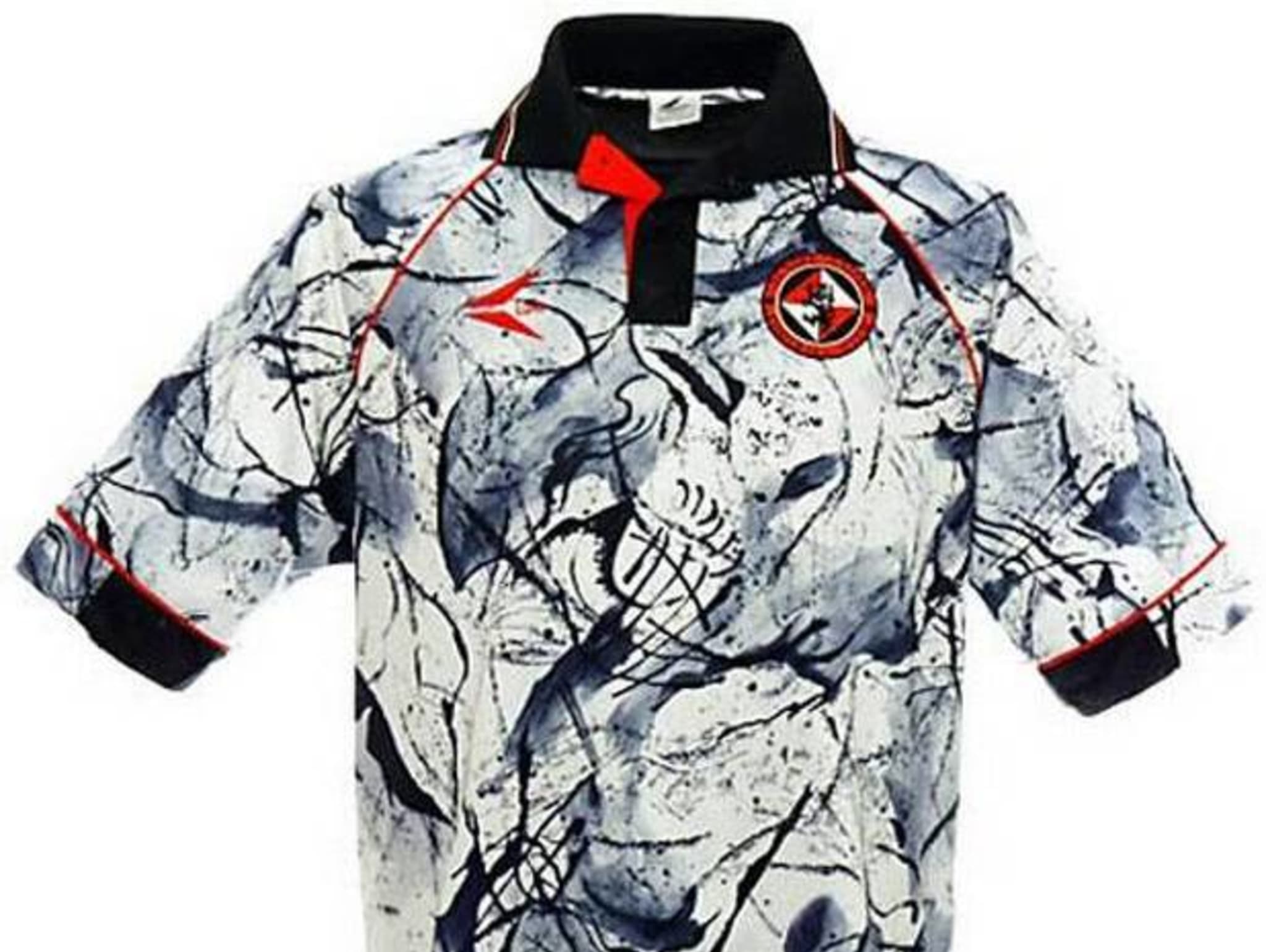
17.Dundee United
In 1993, Scottish side Dundee United decided they wanted to bring a little culture to the pitch, primarily through wearing this little beauty of a strip. It looks like a combination of marble and abstract Sumi-e (Japanese ink painting) and can you really argue with that?
via The Independent
18.Shimizu S-Pulse
We literally don't know how to describe this 1995 Shimizu S-Pulse home strip. It's a mish mash of lines, shapes and logos that almost makes it too much for our eyes to handle. ALMOST. That means we can still be in love with it.
via Sidhe